Skin changes with nature. Your ritual can move with it.
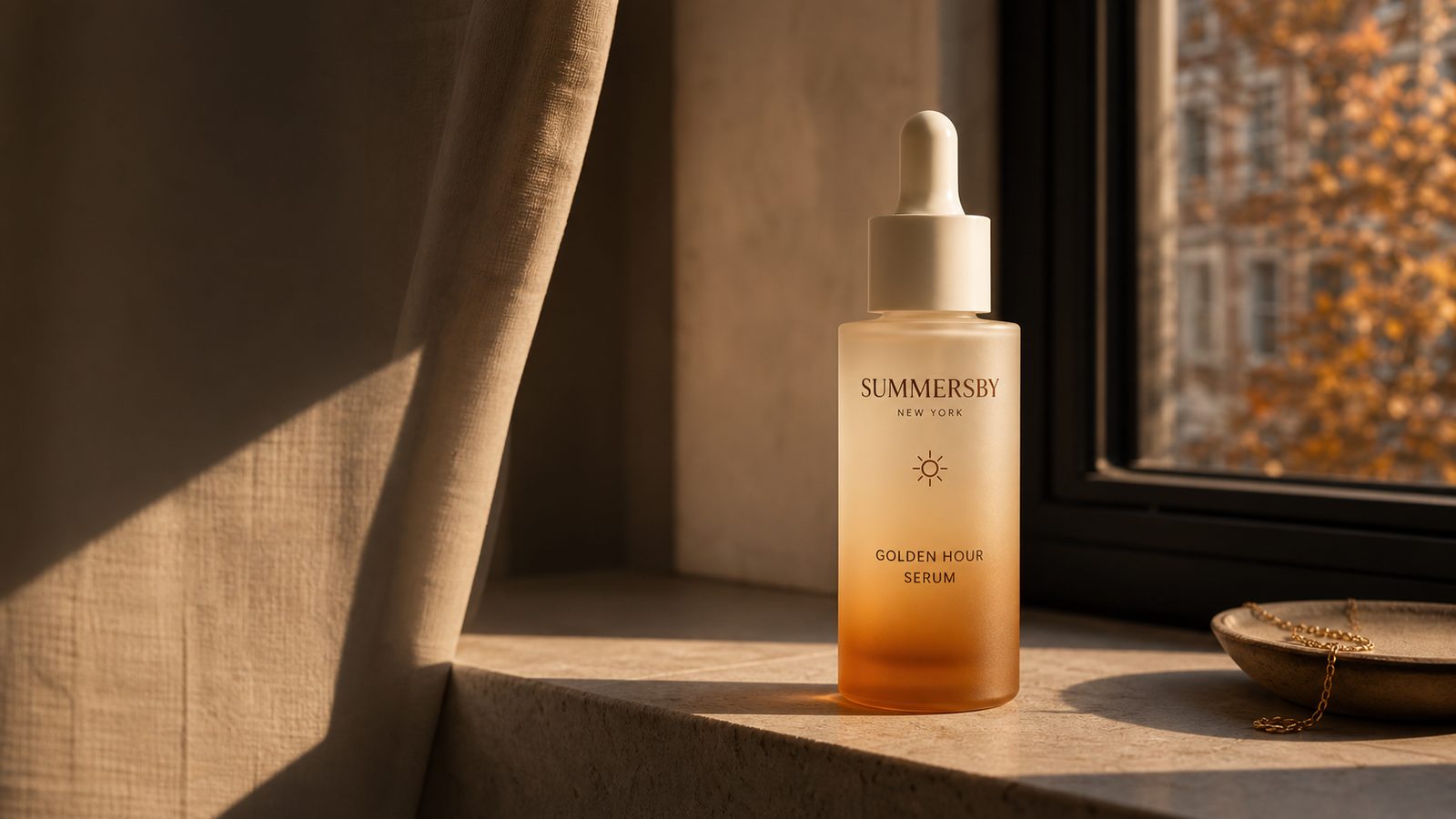
Summersby is a seasonal skincare concept inspired by the changing light, rhythms, and rituals of New York.
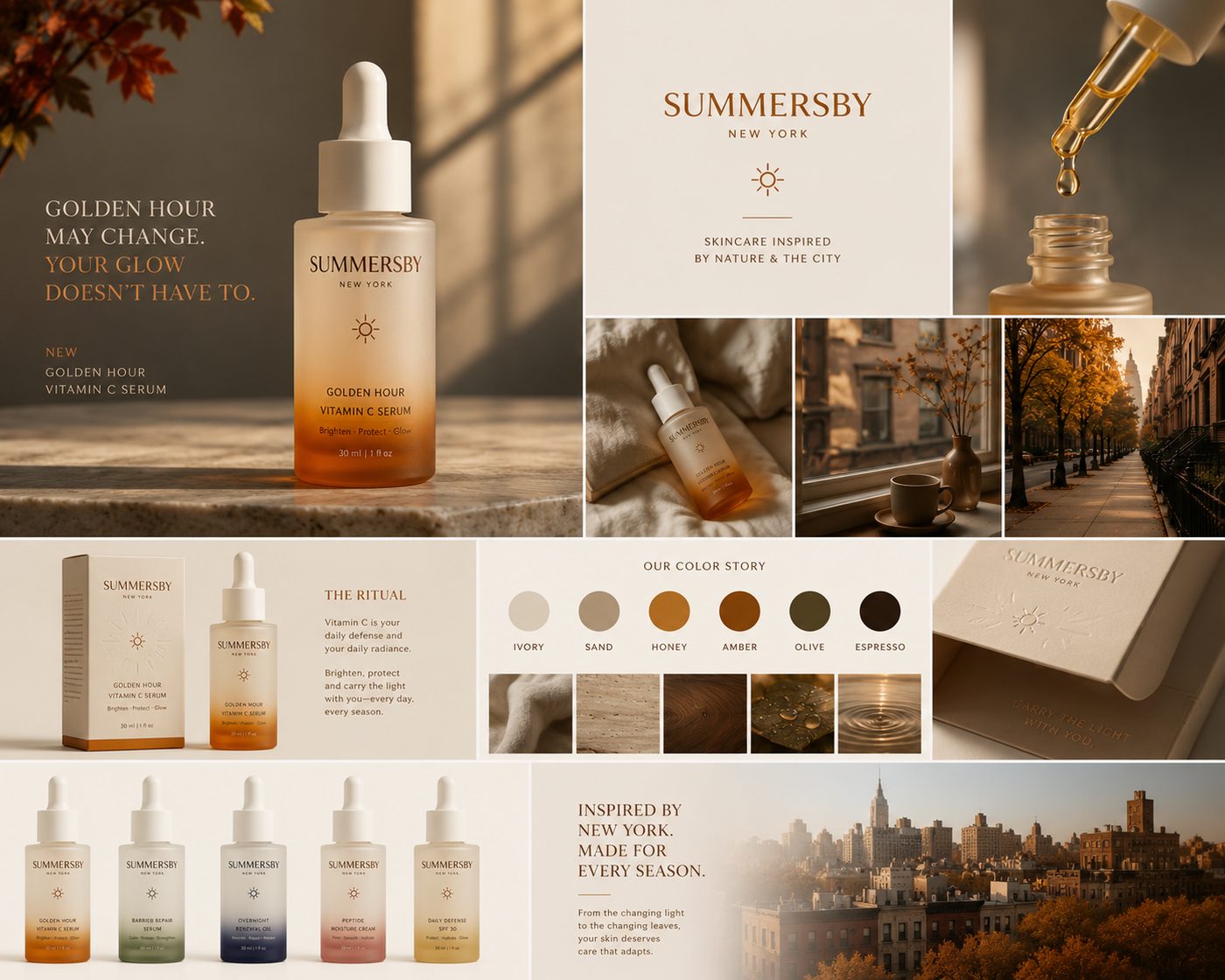
Mood board
The campaign’s packaging references, New York light studies, materials, textures, seasonal imagery, typography and color story.
Six recurring themes
The references collected for this campaign keep returning to the same six moods. Each one is shot in the Summersby palette rather than borrowed, so the board and the campaign are the same world.
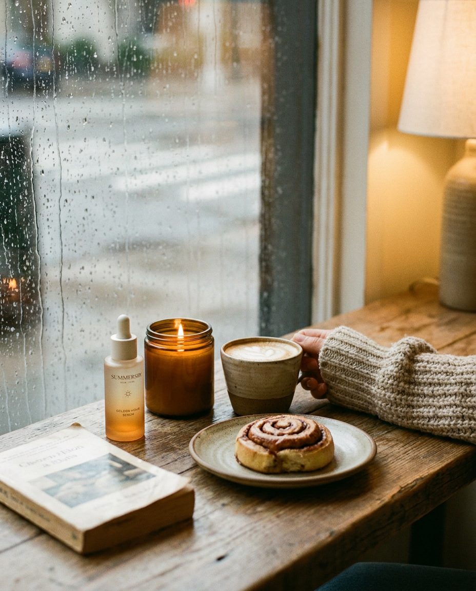
Cozy mornings
Rain on the glass, a candle lit at nine, a coffee going soft. The season arrives indoors before it arrives outside.

The harvest street
Stoops dressed for October, leaves banked against the kerb. The city doing autumn in public.
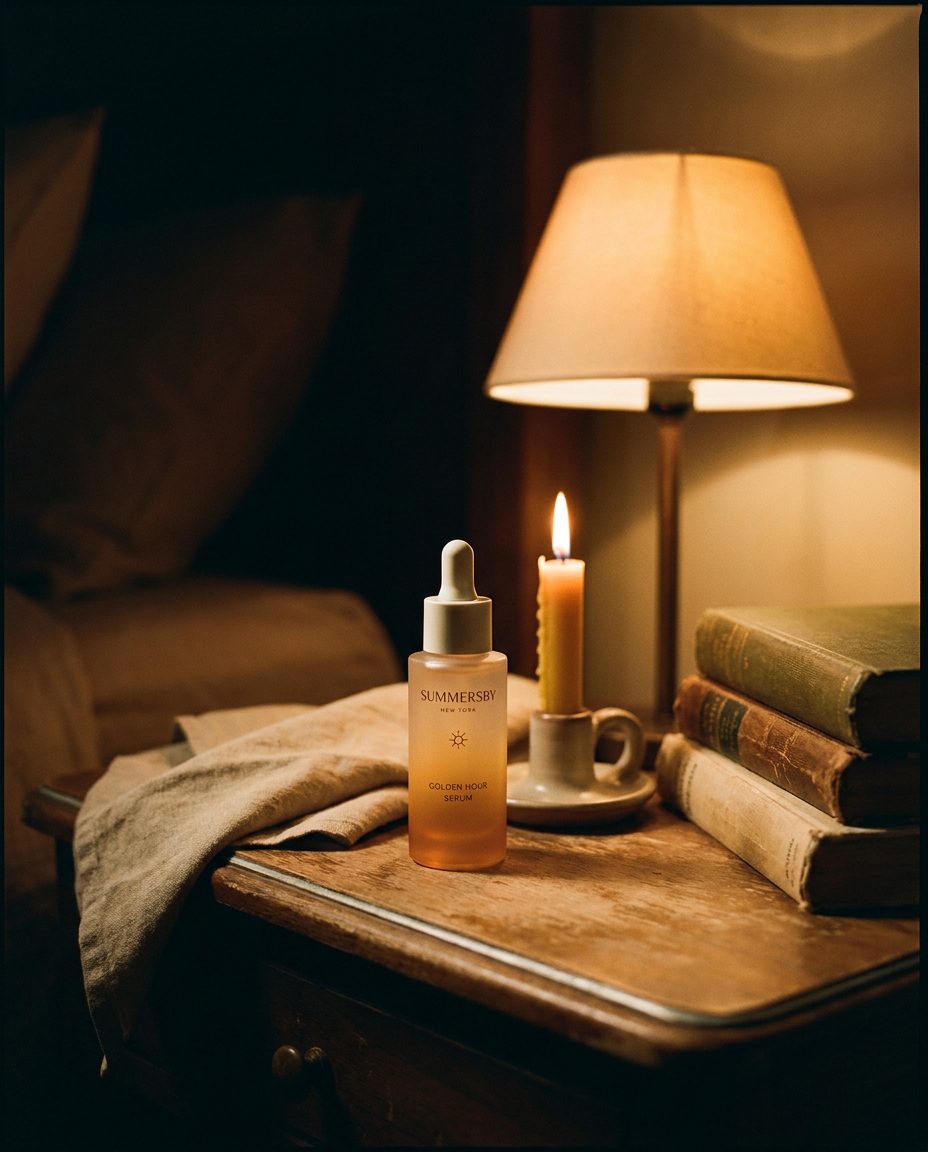
Lamplight hours
The evening half of the ritual. One lamp, one candle, the bottle glowing from the inside.
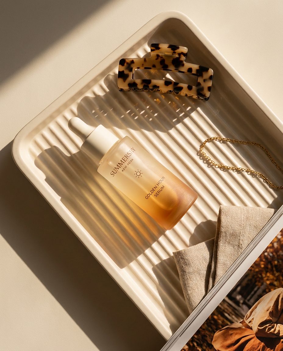
Shelf styling
Hard morning sun on a ceramic tray. The bottle as something you leave out, not something you hide away.
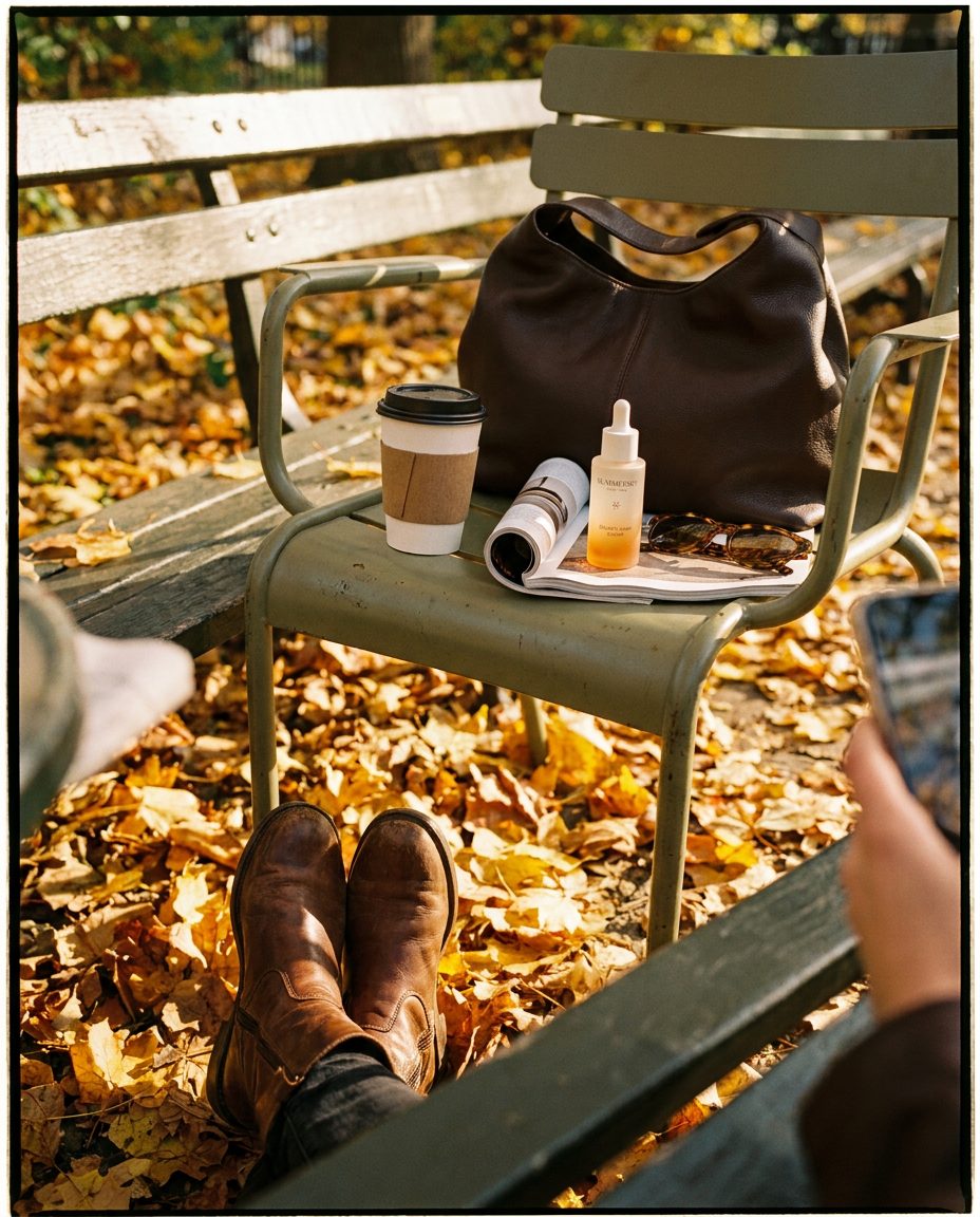
The photo dump
Boots in the leaves, a coffee on a park chair. Framed like something saved off a camera roll, not a set.
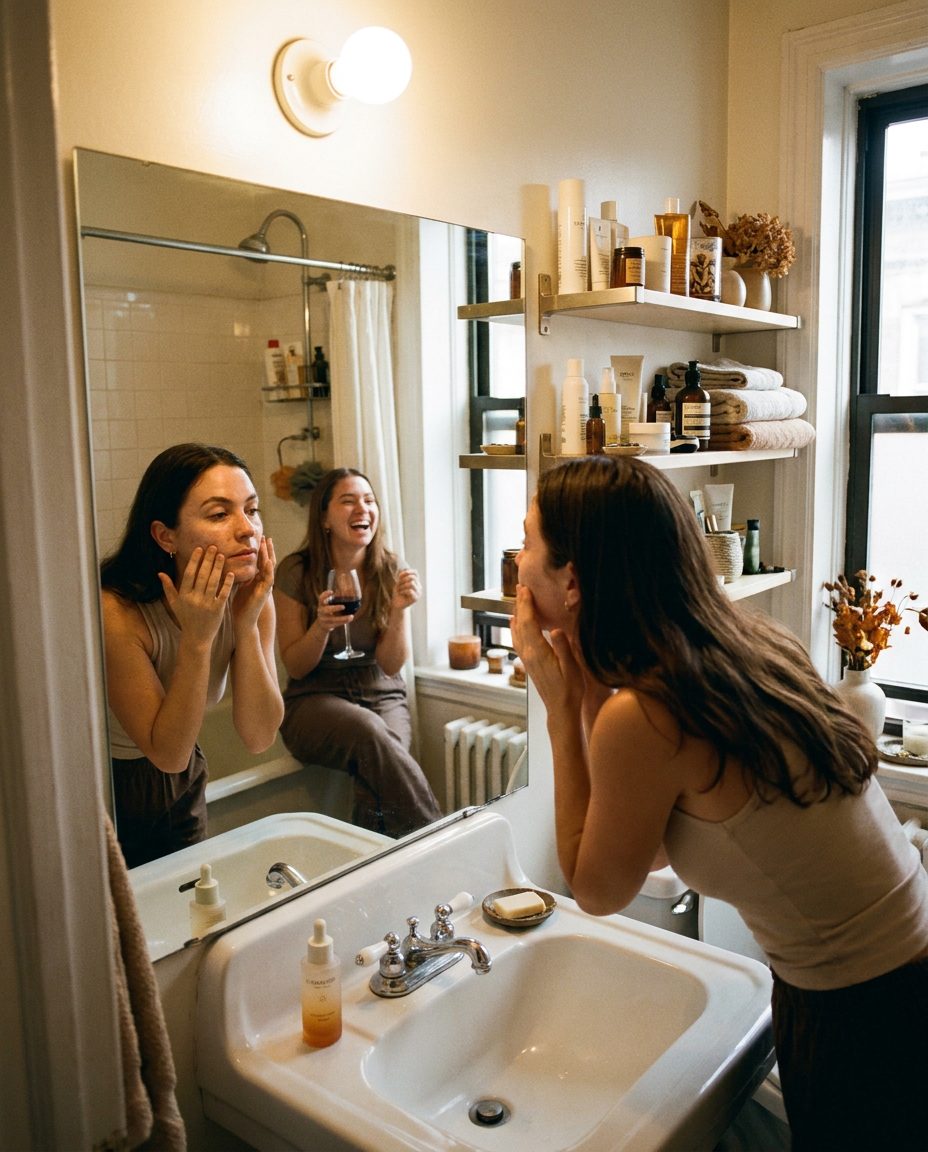
Getting ready
Two friends, one mirror, a conversation that outlasts the skincare. The ensemble-television warmth the campaign borrows from.
One recognizable world, always in motion.
The product, typography and voice remain consistent. Color, light, texture and storytelling evolve with the season.
Light
The poetic link between the Summersby name, glowing skin and the city.
Seasons
Renew, brighten, restore and protect, creating an evergreen annual framework.
Days
A brand designed to live beyond one launch or one beautiful grid.
Carry the light into every season.